Mar'25 - Apr'25
Website Design, Responsive Design, Visual Design
Responsive Website Design,
Visual Design
Designing from Scratch: A Digital Home for Split Studio
Designing from Scratch: A Digital Home for Split Studio
Creating a digital presence from the ground up for the Split Studio @ Edplus
— Overview
— Overview
Split Studio is an interdisciplinary creative team within ASU’s EdPlus initiative that focuses on building human-centered, design-led experiences.
Despite working on impactful projects across education and emerging tech, the studio had no digital home to communicate who they were, what they did, or how others could engage with them.
The team needed a new website, one that could clearly reflect their identity, showcase their work, and scale as they grew.
Team
Team
Myself – UX Designer
Michelle Torres – Senior Immersive Designer
Development Team
— Background
— Background
Split Studio is a design-forward team within ASU’s EdPlus. The team had incredible work under its belt, but one thing was missing: a digital home that reflected its identity, mission, and multidisciplinary work.
Split Studio is a design-forward team within ASU’s EdPlus. The team had incredible work under its belt, but one thing was missing: a digital home that reflected its identity, mission, and multidisciplinary work.
The team had incredible work under its belt, but one thing was missing: a digital home that reflected its identity, mission, and multidisciplinary work.
There was no existing website. The only resource available was a public, outdated Coda document, fragmented and lacking structure. Just an exciting opportunity to build something fresh from the ground up.
There was no existing website. The only resource available was a public, outdated Coda document, fragmented and lacking structure. Just an exciting opportunity to build something fresh from the ground up.
And that’s where I came in.
And that’s where I came in.

Split Studio is a design-forward team within ASU’s EdPlus.
— Goals
— Goals
Our mission was simple: create a clean, responsive website that felt both academic and experimental, something that would resonate with internal teams, external partners, and future collaborators.
Our mission was simple: create a clean, responsive website that felt both academic and experimental, something that would resonate with internal teams, external partners, and future collaborators.
We wanted the site to:
We wanted the site to:
Tell the story of Split Studio what it does and why it matters
Tell the story of Split Studio what it does and why it matters
Showcase projects and team members in a clean, compelling format
Showcase projects and team members in a clean, compelling format
Be easy to navigate, responsive across devices, and built to scale
Be easy to navigate, responsive across devices, and built to scale
— The vibe
— The vibe
From the start, I knew this wasn’t going to be just another standard webpage. Split is about experimentation, collaboration, and design with intent. So I wanted the site to reflect that structured but flexible, clean but expressive, minimal but never sterile.
From the start, I knew this wasn’t going to be just another standard webpage. Split is about experimentation, collaboration, and design with intent. So I wanted the site to reflect that structured but flexible, clean but expressive, minimal but never sterile.
The visual identity needed to strike a balance: creative, but not chaotic. Professional, but not boring.
The visual identity needed to strike a balance: creative, but not chaotic. Professional, but not boring.
Design Principles
Clarity Over Clutter
Modular, Not Rigid
Expressive Minimalism
Consistency with Flexibility
Design Principles
Clarity Over Clutter
Modular, Not Rigid
Expressive Minimalism
Consistency with Flexibility
Design Principles
Clarity Over Clutter
Modular, Not Rigid
Expressive Minimalism
Consistency with Flexibility

— The process
— The process
While working under a strict timeline, we followed a rapid yet intentional design process, from gathering resources and aligning on goals to prototyping in Framer.
While working under a strict timeline, we followed a rapid yet intentional design process, from gathering resources and aligning on goals to prototyping in Framer.
Each step was focused on building a strong foundation while keeping flexibility in mind for future iterations.
Each step was focused on building a strong foundation while keeping flexibility in mind for future iterations.
Process
Kickoff & Discovery
Brainstorming & Ideation
Wireframes & layout
Visual design
Process
Kickoff & Discovery
Brainstorming & Ideation
Wireframes & layout
Visual design
Process
Kickoff & Discovery
Brainstorming & Ideation
Wireframes & layout
Visual design
Then came the real work.
Then came the real work.
Kickoff & Discovery
To kick things off, I conducted a few group discussions with the Split Studio team to understand what everyone envisioned for the website.
To kick things off, I conducted a few group discussions with the Split Studio team to understand what everyone envisioned for the website.
Each session gave me insight into how the team viewed Split its purpose, tone, and the stories they wanted the site to tell.
Each session gave me insight into how the team viewed Split its purpose, tone, and the stories they wanted the site to tell.
These early conversations laid the foundation for everything that followed.
These early conversations laid the foundation for everything that followed.
Why I did this
Helped align the team around a shared vision for the website
Revealed what Split Studio means to different people creatively and strategically
Surfaced early content priorities and tone preferences
Built a strong foundation for all design decisions that followed
Why I did this
Helped align the team around a shared vision for the website
Revealed what Split Studio means to different people creatively and strategically
Surfaced early content priorities and tone preferences
Built a strong foundation for all design decisions that followed
Why I did this
Helped align the team around a shared vision for the website
Revealed what Split Studio means to different people creatively and strategically
Surfaced early content priorities and tone preferences
Built a strong foundation for all design decisions that followed
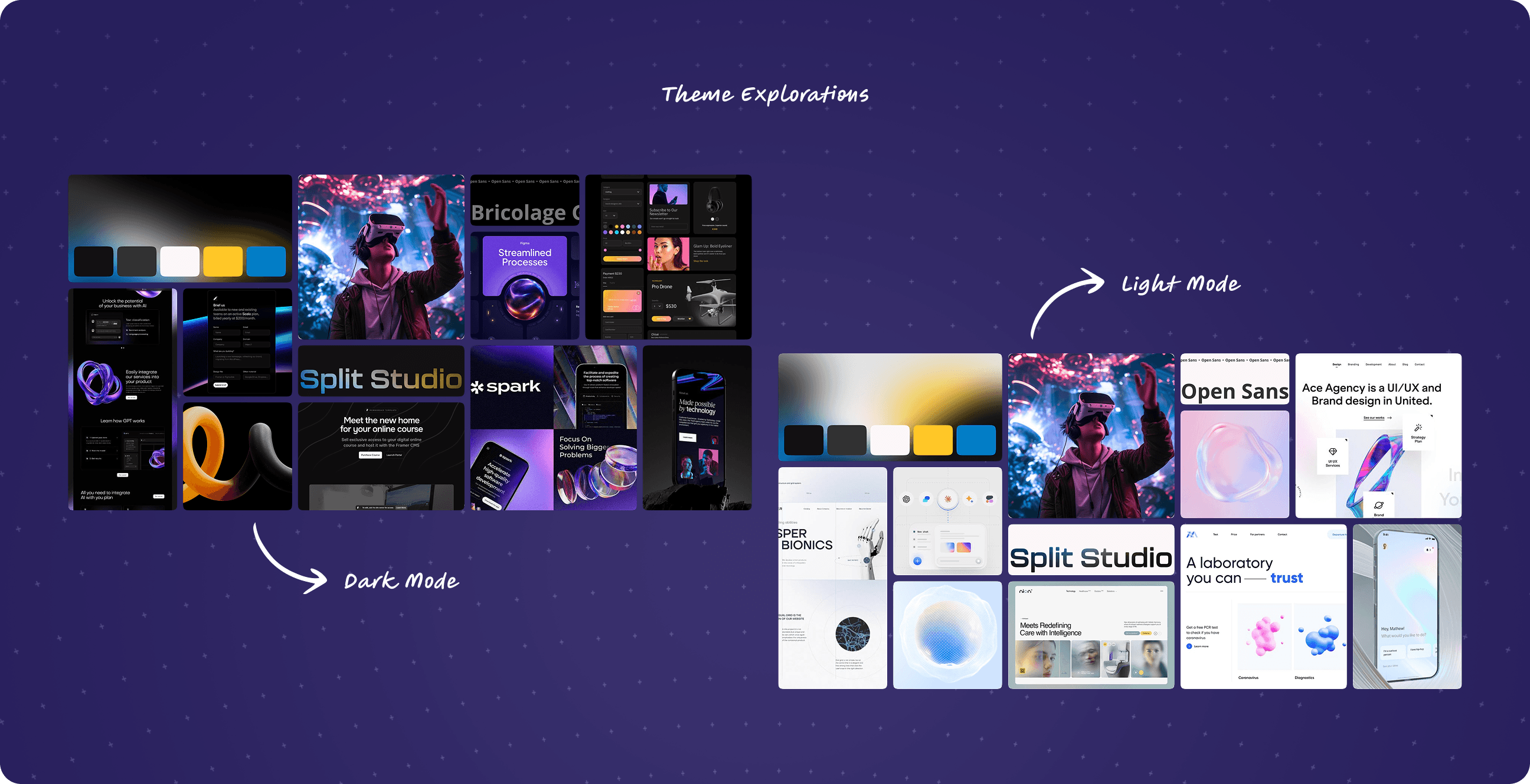
Brainstorming & Ideation
I led a FigJam session with the UX and Visual Design teams to align on tone, content priorities, and how the site should feel creative, minimal, and expressive.
I led a FigJam session with the UX and Visual Design teams to align on tone, content priorities, and how the site should feel creative, minimal, and expressive.
To support this, we gathered visual references for sections like About Us, Meet the Team, and Our Work from similar studios and labs.
To support this, we gathered visual references for sections like About Us, Meet the Team, and Our Work from similar studios and labs.
Using these insights, I created both dark and light-themed moodboards to explore visual direction around style preferences.
Using these insights, I created both dark and light-themed moodboards to explore visual direction around style preferences.
Why I did this
To translate ideas from the kickoff sessions into visual direction
To collect the kinds of visuals and styles the team gravitated toward
To make sure every voice and idea had space in the early design phase
Why I did this
To translate ideas from the kickoff sessions into visual direction
To collect the kinds of visuals and styles the team gravitated toward
To make sure every voice and idea had space in the early design phase
Why I did this
To translate ideas from the kickoff sessions into visual direction
To collect the kinds of visuals and styles the team gravitated toward
To make sure every voice and idea had space in the early design phase
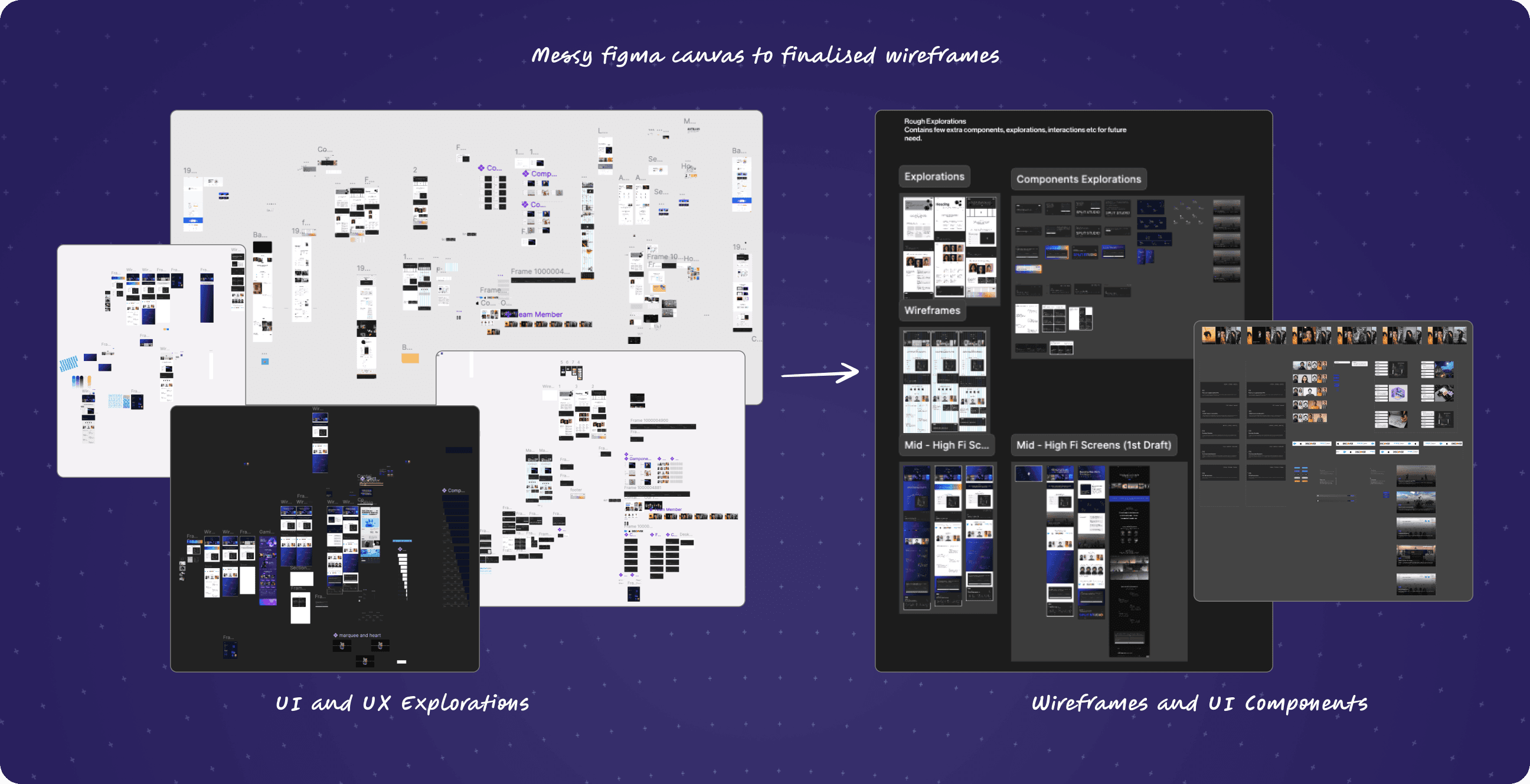
Wireframes & layout
Once the direction was clear, I created wireframes for key pages like Homepage, About, Our Work, and Meet the Team focusing on clear, modular layouts that could scale with the studio.
Once the direction was clear, I created wireframes for key pages like Homepage, About, Our Work, and Meet the Team focusing on clear, modular layouts that could scale with the studio.
I kept the layout clean and flexible, with content blocks designed for clarity and future CMS integration.
I kept the layout clean and flexible, with content blocks designed for clarity and future CMS integration.
Each wireframe focused on hierarchy, flow, and how real users might navigate the site.
Each wireframe focused on hierarchy, flow, and how real users might navigate the site.
Why
To bring structure to the ideas we’d aligned on
To test how the content would flow across different screen sizes
To make future development and content updates seamless
Why
To bring structure to the ideas we’d aligned on
To test how the content would flow across different screen sizes
To make future development and content updates seamless
Why
To bring structure to the ideas we’d aligned on
To test how the content would flow across different screen sizes
To make future development and content updates seamless
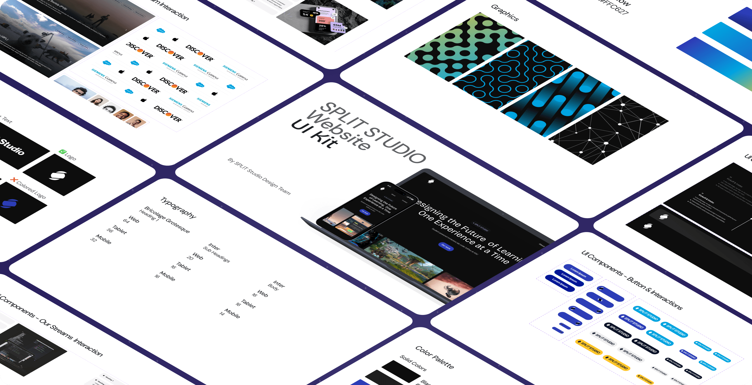
Visual design
I began by building a lightweight UI kit in Figma, defining core components to ensure consistency and scalability.
I began by building a lightweight UI kit in Figma, defining core components to ensure consistency and scalability.
After exploring both dark and light themes, we leaned into a dark, clean aesthetic with pops of color to reflect the studio’s creative identity.
After exploring both dark and light themes, we leaned into a dark, clean aesthetic with pops of color to reflect the studio’s creative identity.
With the visual direction set, I applied the system across key pages and moved into high-fidelity wireframes.
With the visual direction set, I applied the system across key pages and moved into high-fidelity wireframes.
The UI kit included
Typography
Colors
Buttons
Graphics
UI Components
The UI kit included
Typography
Colors
Buttons
Graphics
UI Components
The UI kit included
Typography
Colors
Buttons
Graphics
UI Components
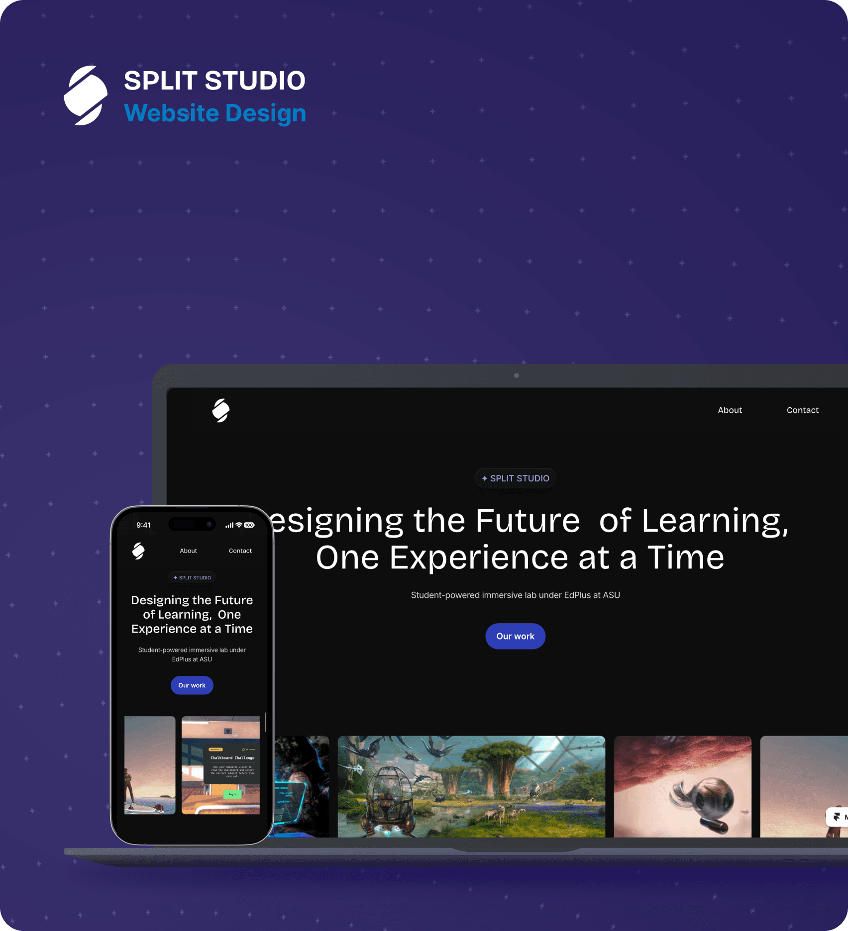
— The Website
— The Website
Since we were on a tight timeline, I used Framer to rapidly prototype the first version of the website and visualize how it would look and feel.
Since we were on a tight timeline, I used Framer to rapidly prototype the first version of the website and visualize how it would look and feel.
This version lays the foundation, and as I transition out, the next designer will carry the work forward.
This version lays the foundation, and as I transition out, the next designer will carry the work forward.

— Challenges and Lessons Learned
— Challenges and Lessons Learned
No Existing Structure or Content
Challenge: There was no previous website to work from, just an outdated Coda doc with fragmented information.
Solution
I initiated kickoff sessions to gather team input, align on core messaging, and identify content needs early. This helped shape a clear structure from scratch.
Solution
I initiated kickoff sessions to gather team input, align on core messaging, and identify content needs early. This helped shape a clear structure from scratch.
Solution
I initiated kickoff sessions to gather team input, align on core messaging, and identify content needs early. This helped shape a clear structure from scratch.
Tight Timeline
Challenge: We had limited time to move from concept to functional prototype, which could’ve compromised quality.
Solution
I used Framer for rapid prototyping and decision-making, allowing us to visualize and test interactions without slowing down development.
Solution
I used Framer for rapid prototyping and decision-making, allowing us to visualize and test interactions without slowing down development.
Solution
I used Framer for rapid prototyping and decision-making, allowing us to visualize and test interactions without slowing down development.
Too Many Ideas, Not Enough Time
Challenge: During ideation, the team generated a lot of exciting ideas, animations, interactions, and new content sections, which made it tempting to do everything at once.
Solution
We refocused by asking: What does Split Studio stand for at its core? That became our North Star. We prioritized building a clear, expressive foundation first something that authentically represented the studio.
Solution
We refocused by asking: What does Split Studio stand for at its core? That became our North Star. We prioritized building a clear, expressive foundation first something that authentically represented the studio.
Solution
We refocused by asking: What does Split Studio stand for at its core? That became our North Star. We prioritized building a clear, expressive foundation first something that authentically represented the studio.
— Reflection
— Reflection

Challenging yet rewarding
This project was a crash course in building a digital experience from the ground up without templates, without shortcuts. It pushed me to think beyond surface-level visuals and design a system that could grow with the team.
Challenging yet rewarding
This project was a crash course in building a digital experience from the ground up without templates, without shortcuts. It pushed me to think beyond surface-level visuals and design a system that could grow with the team.
Challenging yet rewarding
This project was a crash course in building a digital experience from the ground up without templates, without shortcuts. It pushed me to think beyond surface-level visuals and design a system that could grow with the team.
I learnt:
How to lead a structured process in an unstructured environment
The value of team alignment before pixels
The value of team alignment before pixels
Designing with scalability in mind from day one
Designing with scalability in mind from day one
That quiet, intentional design often tells the strongest story
That quiet, intentional design often tells the strongest story

